Color Theory for Designers – Understand Material Design Colors
Color plays an essential role in design and everyday life. It can draw your attention to a picture, trigger a certain mood or emotion, or even convey something important using no words at all.
You hear a lot about color theory from color harmony and saturation to brightness, but what does it all mean?When we look at our design apps and look at blank art-boards with the little rainbow color picker, how do we actually find out the best colors for our websites, interfaces, and apps design? How do we know which colors look great together and which don’t?
The answer is simple: color theory. Artists and designers have been following color theory for centuries, but it’s very easy and anyone can learn it. It can help you feel confident in many situations, whether it’s choosing colors for a design or putting together a perfect outfit. All it takes is a brief insight, and you’ll look at color in a whole new way.
Primary, Secondary and Tertiary Colors :
Let’s start from the very beginning with a refresher on the basics. Do you remember learning about primary and secondary colors in school? Then you already have some knowledge on how the visible color is made.
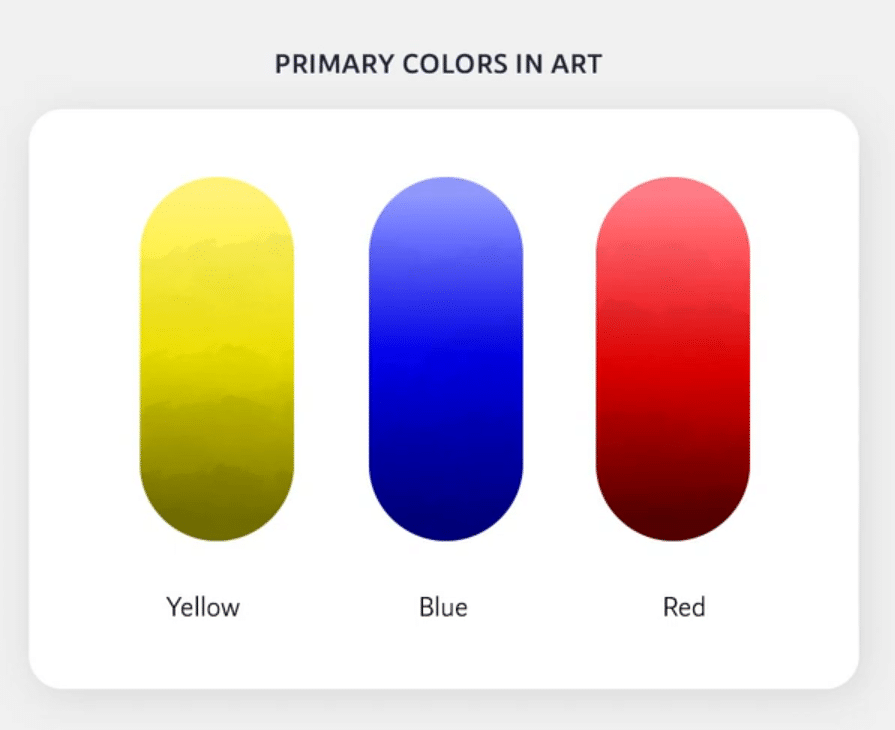
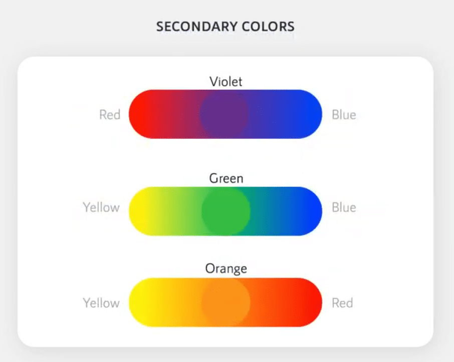
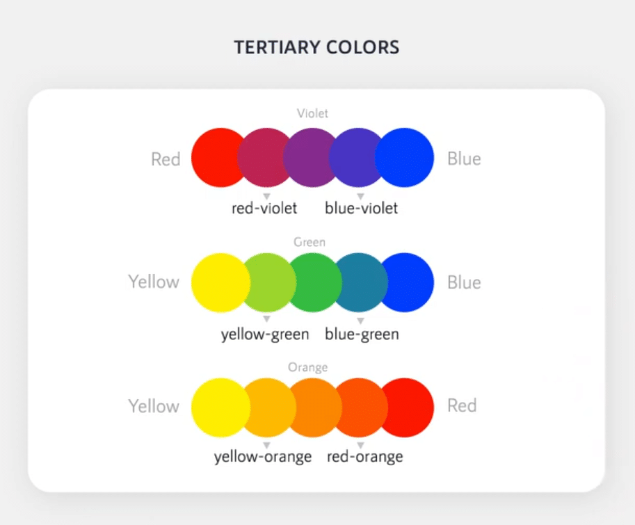
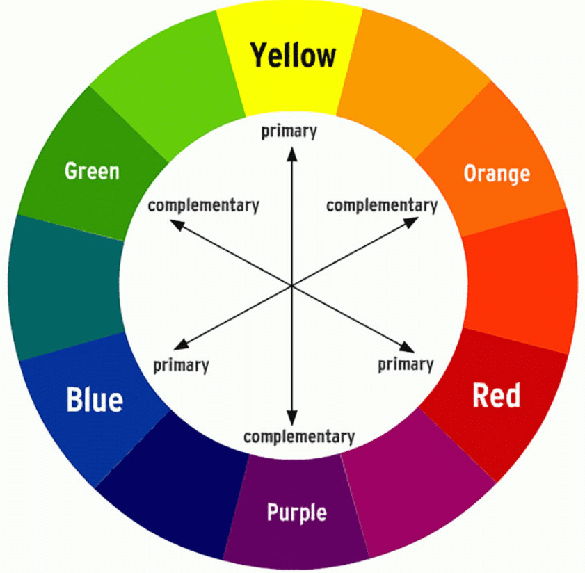
There are three primary colors: Red, blue and yellow. Then secondary colors are the colors created by mixing two primary colors together. The secondary colors are purple from red and blue, green from blue and yellow, and orange from red and yellow. If we mix these colors, we will get more intermediate shades, such as red, orange, yellow and green called tertiary colors. And the process goes on. Together, they form the famous “color wheel”. You can probably now sort out where it gets its name.
Understanding HSB
Now, let’s take it one step further by learning about hue, saturation, and brightness (HSB also said HSL & HSV). These are terms you might not come across in everyday life, but they are essential for understanding more nuanced colors, like all kinds of little paint chips in a hardware Store.
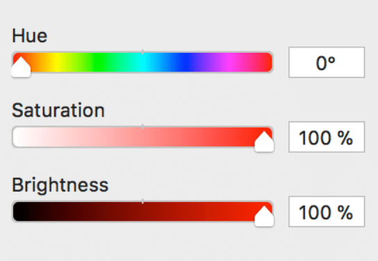
- Hue is the easiest. It’s basically just another word for “color”. It refers to a different color from the color wheel.
- Saturation refers to intensity, i.e. whether the color looks more subtle or more vibrant.
- Brightness (value) is related to the darkness or lightness of the color, ranging from black to white.
Making variations of the same Hue
You may have seen a color picker in many softwares including inside WordPress. Here is how you can play with brightness and saturation in the color picker to make different shades of your brand color (same hue).
If you need a darker color variation, you need to increase the saturation and decrease the brightness. You just have to pull the color picker away from white (subtleness) and closer to black (darkness).
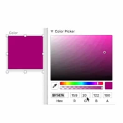
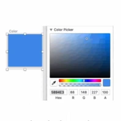
If you need a brighter color variation, you need to lower the saturation and increase the brightness. You just have to drag the color picker closer to white (subtleness) and further away from black (darkness).
So how do we put all of this together to create professional looking color schemes? There are actually some proven formulas based on “color harmony” that can help. All you need is the very famous color wheel.
Color harmony formula (Color theory)
The main color theory revolves around the color wheel. These are the formulas that create the basis for color palettes that work harmoniously together. There are a few proven formulas that we can refer to ensure that we have created the right color harmonies in our color palettes.
Monochromatic
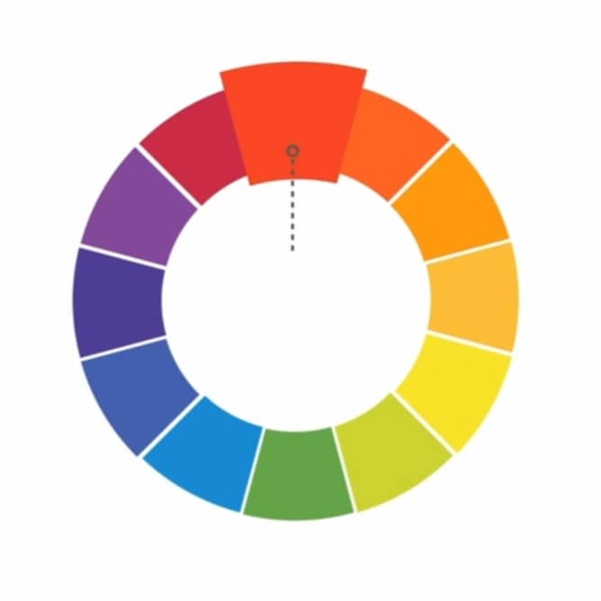
The easiest formula for harmony is monochromatic because it only uses one color with different saturation and brightness. Just pick a color or hue from the color wheel and use your knowledge of saturation and brightness to create different variations.
The best thing about monochrome color schemes is that they are guaranteed to match as the hue is same.
Analogous
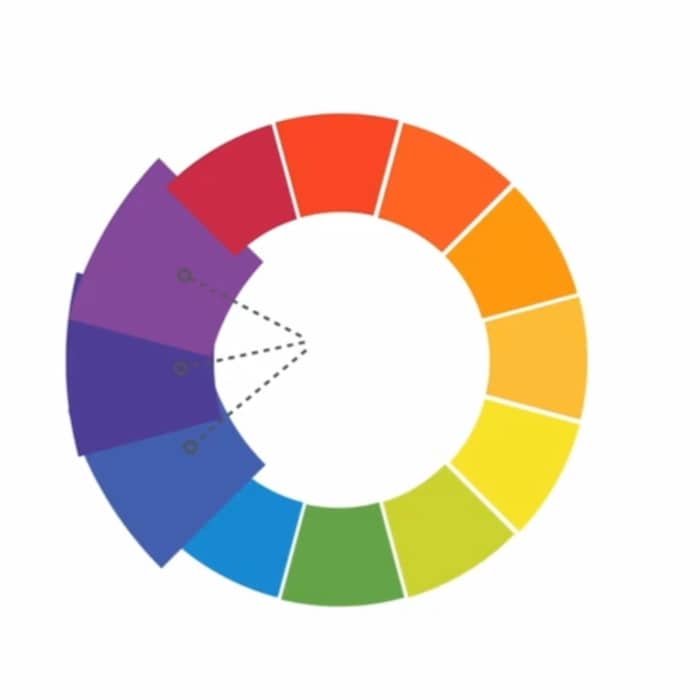
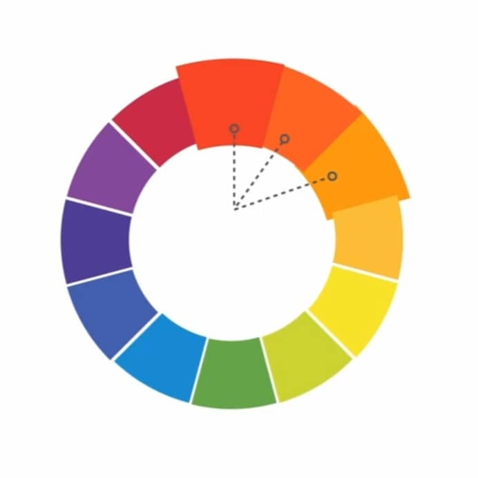
An analogous color scheme uses two colors adjacent to each other on the color wheel. These can be warm colors like red and orange or cool colors like blue and purple.
Complementary
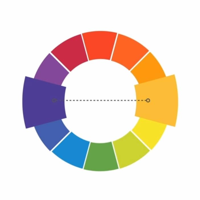
Complementary color combinations use colors that are opposite each other on the wheel, for example, blue and orange, or red and green.
To avoid overly simplistic complementary color schemes, add some variety by introducing lighter, darker, or unsaturated tones. Just play with saturation and brightness to create more refined color palettes.
Split-Complementary
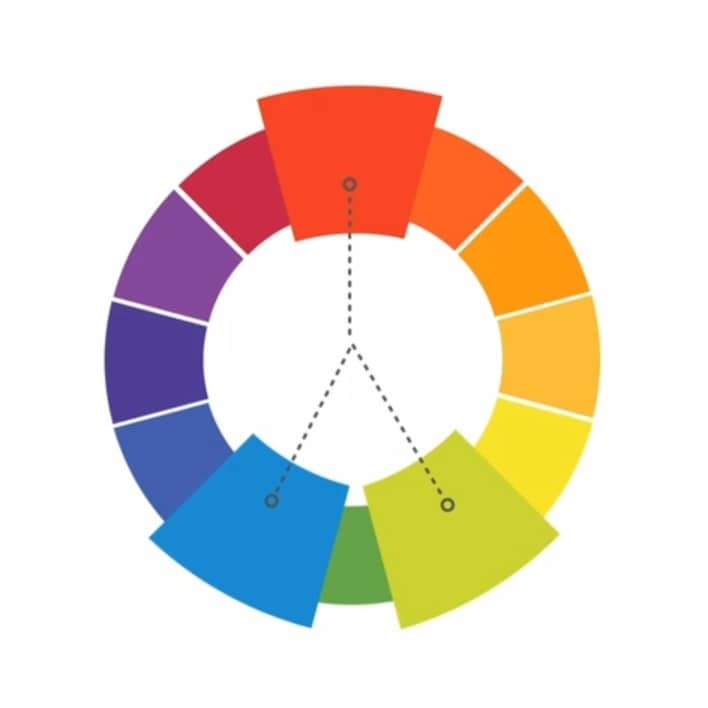
A split-complementary color scheme uses colors from either sides of the complement. This gives you the same level of contrast, but more colors to work with and potentially more interesting results.
Triadic
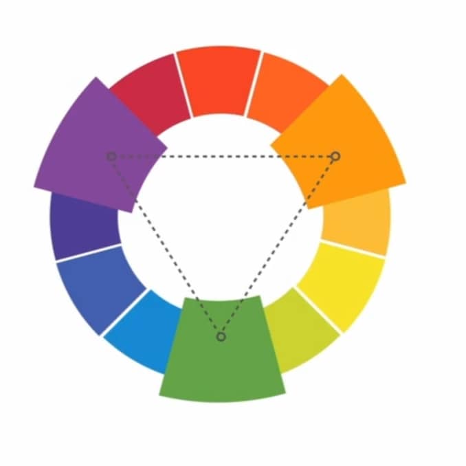
The triadic color palette uses three evenly spaced colors, forming the perfect triangle on the wheel. These combinations tend to be pretty striking – especially with primary or secondary colors – so be careful when using them in your work.
Quadrant
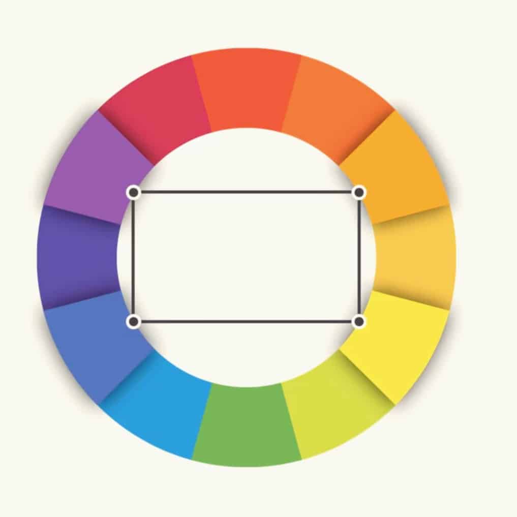
Quadrant (or Triadic) color schemes form a rectangle on the wheel, using not one but two pairs of complementary colors. This formula works best if you let one color dominate while the others act as an accent.
Color Accessibility
The contrast between these colors is even more important than the colors you choose. Contrast leads to proper visual hierarchy and lets the user know what to look at. It’s also a big part of accessibility for those who are color blind or can’t spot the minor details from one color to another.
WCAG 2.1 are the whole set of guidelines which define how to make Web content more accessible to people with disabilities. In color guidelines, they have separate guidelines for every page element while all have three matching levels A, AA, and AAA. If any content does not pass the contrast standard, it can interfere with a user’s ability to grasp all content on the Web page. AA is widely regarded as the industry standard.
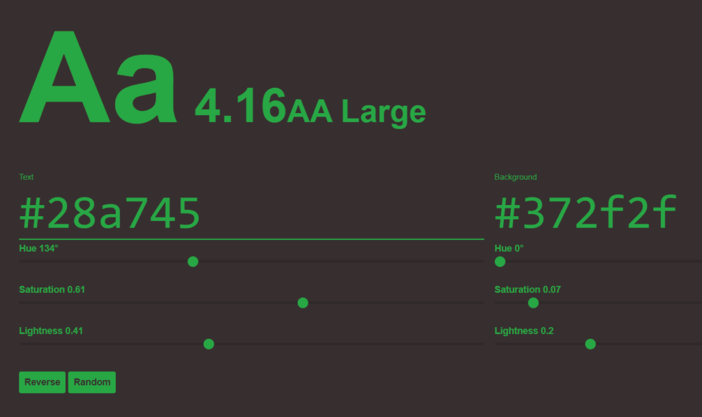
Colorable is a great tool for testing the contrast of text colors. You can play around with different colors and get a pass or fail depending on contrast criteria.
Do’s and Don’ts
First, don’t be afraid to experiment with the palette and create your own unique interpretations. That’s what these formulas really are: starting points to guide and inspire you. Just keep in mind that colors should follow the appropriate color harmony using the formulas of color theory.
There are some classic things you should and shouldn’t do in color. For example, have you ever seen colors that seem to vibrate when placed next to each other?
The solution is to tone it down, literally. There is a simple way to do it; Start with a single color and try to adjust its brightness or saturation. Sometimes a little contrast is enough to make your color palette great.
The color palette should be within the larger scope of your interface and the design scheme. So make sure you have multiple shades of gray-scale and low saturated colors.
Readability is a very important factor in any design. Your colors should be clear and pleasing to the eyes. Sometimes that means not using color, at least not in great detail. Neutrals like black, white, and gray can help you balance your design, so when you use colors, they really stand out.
Each color sends a message. It is important to consider the tone of your project and choose the color scheme that suits it. For example, bright colors often have a fun or modern feel. Unsaturated colors often appear more business-like. Sometimes it just depends on the context, you can imagine the flexibility of the colors.
Make sure to always color the gray and black with a bit of your brand color. Pure black and gray can be very rough and look immature.
Color Tools
- Adobe Color: Have accessibility tool for identifying which colors are in conflict for color blind. Can save palette for later, and edit them.
- Colormind: See the color palette when applied to a demo. Lock a color that you already like while generating a new palette.
- Cohesive Colors: Tool that may help you to create cohesive color schemes.
- Scale: Offers a high level of customization to any color palette you input or generate.
- Picular: Generate a color palette based on a specific word or theme.
- Coolors: to help create color palettes.
These are some online color palette generators. These generators are frequently used by UI Designers. You are not required to go after them. You can use your own knowledge to create your palette.
Even it is possible to design an entire interface in a single hue. In fact, I encourage all beginners to choose monochromatic color scheme for their projects because it is the safest course.
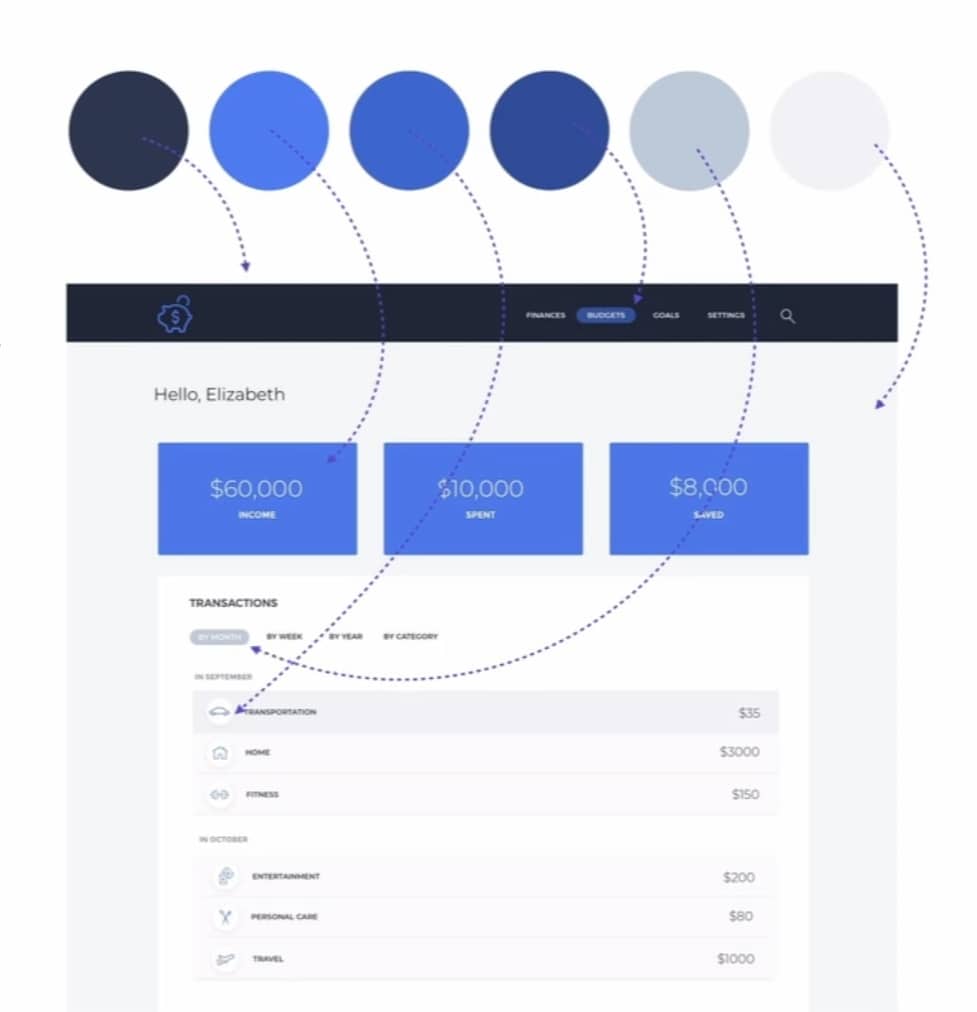
Pick a primary color based on color psychology. For example: if I’m designing a finance app, I will use blue, because it stands for trust, security and people like it.
So let’s see how we can do this:
First, choose a base color that is the primary color for your user interface, typically your brand color.
Next, choose shades close to your base color. Only change saturation or brightness, leaving the hue alone.
Finally, choose the darkest color and a range of different gray levels by dragging the saturation to the gray side of the color slider.
And voilà! You now have a color palette you actually know how to apply. And you created it all by yourself!
Closing Note
You can find color scheme ideas in all kinds of interesting places, from advertisements and brands to popular artworks. You can also use a web resource to browse the color palettes or create your own. Even experienced designers take inspiration from the world around them. There is nothing wrong with finding something you like and making it your own.
Everywhere you look there is color, color and more color. It can be scary to use it in your job, but it doesn’t have to be. Just keep experimenting and remember what you learned about color theory. Soon, choosing of brilliant color combinations will become second nature.
I hope you enjoyed learning the basics of color. So what do you think is the best coloring tool? Tell me in the comment.
